Welcome to the Future of ASHT
Building on the richness of ASHT’s past and dynamic present, we had a goal to create a more inclusive future for the practice of hand and upper extremity therapy.
Our Evolving Brand Story
It was 1975 in San Francisco when the founders of ASHT first gave birth to the concept of a united hand therapy organization. Their original motive was to get together to boost their learning curve. They realized they were stronger united than isolated. The term “hand therapy” hadn’t even been used yet; it was coined when the group was deciding on a name for the new organization.
Since then, the American Society of Hand Therapists has become the premier organization for those who work in this specialty. Now, a focus on the total clinical area treated by the specialty has inspired change.
Simply, hand therapists don’t just provide therapeutic interventions on the hand. They are specialists who can evaluate and treat any condition related to the upper extremity. For ASHT, it is important for this message to be more widely known.
We determined the best way to do this was by evolving the brand. As we speak to the larger stakeholder audience and recruit the next generation of professionals into our ranks, we felt it was time to develop a brand that more accurately reflects the area of expertise.
Here is how our brand evolved to its new look, its stronger voice.
The Evolution
The rebranding process has been a collaborative one with the goal of expanding the message as its north star. All decisions were made through collaboration across a broad spectrum of representation and closely followed by the ASHT Brand Task Force.
We conducted interviews with ASHT members, current and former volunteer leaders and professional stakeholders such as hand surgeons, physician assistants and nurse practitioners, to better understand the current state of ASHT’s brand.
We reviewed the competitive landscape to see how other organizations promoted their brands, how they referenced hand therapy to determine how ASHT fits in this environment and how we would differentiate ourselves.
With that input, we developed a survey to get insight from the membership as a whole to further explore perceptions of who ASHT is today and will be in the future. Here is what you told us:
- While members feel connected to the hands in the current logo, they recognized it does not accurately represent the specialty in terms of the upper extremity
- Members prefer a clean, professional look to the logo as a way of representing the specialty
- Members feel that “specialized” and “professional” best describe the organization
We heard you. The brand was evolved with these key points in mind and an intentional focus on representing this unique specialty.
A New Look
With our learnings from the discovery and research phase complete, we set about designing and selecting the final logo. We underwent many designs and iterations in the creation of the new look. At the end of the process, the final design was the one that most accurately defined who ASHT is and what it is that we do. We stayed true to our north star.
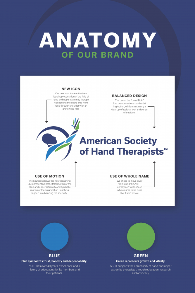
We maintained our name to build on its legacy. However, to be more easily identified, we moved from using the acronym “ASHT” in the logo to the full name, “American Society of Hand Therapists.” We will continue to be known as ASHT in our marketing and other messaging touchpoints, but felt it important to be clearer in the most forward-facing part of the brand, our logo.
The logo conveys the optimism, perseverance and determination that defines ASHT as it charges ahead into a bright future, as well as that of professionals and patients touched by the very practice for which ASHT advocates.
Our logo was designed to be literal in its representation of ASHT. The overall design is clean and simple to convey professionalism and credibility. The color palette remains the same, as it has a modern, but classic look. Finally, the graphic element was designed to speak to the heart of what we do: treat the hand and upper extremity. The graphic image includes a person with an arm reaching up, implying motion. The hand and upper extremity were designed to have an anatomical feel and we used color to highlight the whole limb as the clinical area of focus. The logo is meant to represent in a very clear way who we are and what we treat.
The logo is a reflection of our positioning statement and our vision. It is the simple summation of what we strive for as an organization:
Hand & Upper Extremity Specialists, Reaching Higher.