By Shellye (Bittinger) Godfrey, OTR/L, CHT, CDE; edited by Susan Johnson Melat, OTR, CVE, CHT -- 2002
 The year 1977 was a professional turning point in my career. I had moved from New Orleans to Chapel Hill, NC, and switched from pediatrics to hand trauma, and had met the ultimate mentor, William H. Bowers, MD, anatomist, artist, teacher and hand surgeon par excellence. Dr. Bowers casually offered me a membership application for this "interesting new hand therapy group," which was just forming and offering a challenge to design their logo.
As an active member of the American Society for Surgery of the Hand (ASSH), he had received a membership application and flier for a logo design contest from the original ASHT board. The board was organizing ASHT's inaugural meeting in Dallas, to be held in February 1978, at the same time as the ASSH Annual Meeting – a precedent which would continue for many years.
Certainly humbled yet honored by the offer, I quickly got to work on completing and sending in the membership application, sweating bullets over whether I would be accepted. The logo contest was a different matter. An artist I am not, and I was already stressed over the application process. Not one to take "no" for an answer nor turn down a challenge, Dr. Bowers, Vietnam veteran and the recipient of the first Bunnell Traveling Fellowship, convinced me that we should at least give it a try and we did.
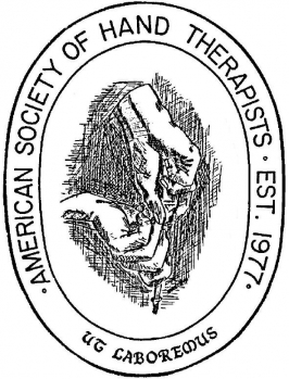
We put our heads together, with Dr. Bowers as the artist of the pen and ink rendition of hands working together. The vision of such an organization of therapists specialized in the treatment of hand problems was awesome to me and so many of those "original six" were already my secret mentors. At that time, most of us worked at our hand surgeon's elbows, absorbing everything we could learn. The logo had to be worthy of representing an auspicious group, and be able to withhold the test of time.
Enter Latin and "the year of the hand therapist – 1977." My brother, Tom Sears, a linguist by profession, contributed "ut laboremus," which translates to "that we may work," among many other meanings.
The drawing, which was original artwork without professional editing, illustrates two hands manipulating a tool (screwdriver). One could reproduce the artist's depiction by asking a person to grasp a screwdriver and begin to mount a screw into a piece of wood. To appreciate this particular view, the observer would position themselves behind and to the dominant side of the worker.
Dr. Bowers and I attended the ASSH/ASHT inaugural meeting in Dallas later that year. The logo display board was in the exhibit area, where several logo submissions could be viewed by the membership. The winning logo design would receive $50 (our membership fee at the time!).
One of the first business agenda items at the meeting was voting into membership both Active and Associate applicants, followed by a membership vote on their logo choice. The cover of our first Annual Meeting program, had a circle with a "?" inside. The program cover for the second Annual Meeting revealed our official logo for the American Society of Hand Therapists – the unanimous choice of the founding members. As the original logo was a pen and ink drawing, the membership also voted on the colors they wanted, which interestingly were red, white and blue as depicted on the first issue of the Journal of Hand Therapy (October/December 1987).
Over the years, the logo has gone through some changes and became our official registered trademark in 1985. The restriction of its use for only ASHT sanctioned materials/programs was so important that it was included in our bylaws, with disciplinary action for any unauthorized use or abuse.

